

Redesigning home search for
the AI-assisted era
Zillow, the leading U.S. real estate website, hosts about 2 million daily users. Since it launched in 2006, the home shopping experience rarely changed.
During my tenure, we delivered our first AI-powered experience and launched the biggest redesign in 5 years to address issues, resulting in a 26% reduction in drop-offs and 7% increase in customer satisfaction.
As Director of UX for the home page, search, and home details page (HDP), I led a team of 8 designers and 1 manager to help make those changes.
What this project taught me about AI design
This became one of my most clarifying AI product design experiences — not because everything worked, but because of what didn't. We ran two AI-powered feature experiments, discovered specific failure modes unique to a regulated consumer context, and made the deliberate call to redesign our approach around how people actually shop.
The result was an AI-informed experience that felt invisible to users but drove measurable outcomes. It's now the clearest example I have of when to use conversational AI, when not to, and how to design the right alternative.
Framing the problem to solve
There were issues with the shopping experience
Research revealed:
Buyers found it hard to locate information on the lengthy home details page
Call-to-action (CTA) buttons competed with needed information
Most buyers shop for months or years before they’re ready to engage with an agent or buy, yet the Zillow experience was designed for users to take immediate action
Heuristic reviews suggested:
The hierarchy on the home details page was confusing
CTAs didn’t align with user goals
Competitive analysis indicated:
Users found it more difficult to discover homes on Zillow than on competing sites
Zillow had substantially more CTAs than competitors
Zillow didn’t offer the lifestyle information that competitors provided
Unintended outcomes:
As Product Managers prioritized new features and CTAs, they added them without regard for the overall experience and buyers’ jobs to be done (JTBD).
We needed a holistic approach — it was time for Design to sell the organization on a compelling, effective, and comprehensive solution.
And, as AI was being rolled out to consumers, how might Zillow leverage it to improve the experience?

Putting the metrics into perspective
Zillow’s most important CTA is the contact agent button. Users who click it are connected with an agent who pays Zillow for the lead.
Buyers often clicked the button because they thought they could ask a simple question about the property — their goal wasn’t to connect with an agent who could represent them in a buy transaction.
Of users who click that CTA, on average 76% abandoned before connecting with an agent. How might we help users accomplish their goals and reduce dropoffs?
Saturday Night Live even did a skit about the phenomenon.

The strategy
Support the shopping experience
Provide an experience that allows the business to deliver higher-quality leads to agents while helping users discover and have the confidence to buy a home:
Make information easier to find and consume
Leverage AI to improve the home search experience
Provide shopping tools that help buyers process and save information about homes they’re interested in (especially the 90% of people who shop with another person)
Reduce funnel drop-offs, by addressing user goals
Improve search
Help buyers get a “better sense of home” (a brand promise)
Sell the concept
Before I could get the organization to prioritize our approach over new features, I needed them to fully understand the value of solving these problems.
We conducted a 2-week design sprint with a cross-functional team, leveraged existing personas and known pain points, then riffed on narratives of positive shopping experiences that align with Zillow’s company-wide goals and mission.
I didn’t want to host an ideation session where the team talked about a collection of features; I wanted the conversation to be about our target personas.
To kick off the ideation session, we shared our research and hypotheses.
The research insights
Users find it difficult to find information on Zillow’s home details page
They’re likely to start their home search on Zillow (because it’s a familiar brand), but subsequently go to competitor sites to get lifestyle information such as climate and crime risk, noise, neighborhood amenities, and schools
They’re afraid of being spammed with phone calls if they reach out just to get questions answered
Our hypotheses
Millions of people “Zillow-surf” to dream about homes months and sometimes years before they’re ready to buy. If we support their complete shopping journey and nurture them with insights and advice along the way, they’re likely to be on Zillow when they’re ready to buy.
If we make it easy for buyers to shop together, they’re likely to use Zillow instead of a competitor. This may also differentiate us from the competition and enhance our ability to understand what buyers are looking for.
Most shoppers track homes of interest on spreadsheets. If we make it easier for buyers to share information on Zillow, we’ll become more “sticky” and they’ll likely use us every day of their search.
If they’re on Zillow when they find “the one” they’re more likely to work with a Zillow agent.
If Beth and Brandon feel supported and get answers without being prematurely forced into a relationship with an agent, they’re more likely to use Zillow.
If we can make search effortless, like having a conversation with a real person, then Beth and Brandon will be more able to articulate their needs and find homes that fulfill their criteria.
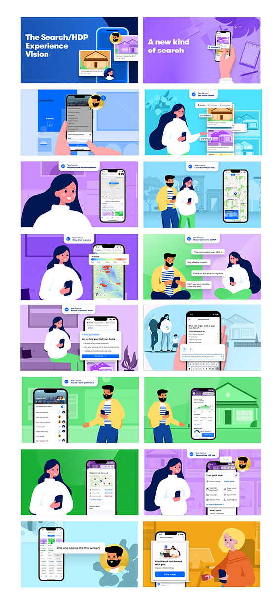
Crafting a vision and narrative of better experiences
Narratives help us focus on the user and how they feel about and accomplish their goals. They are also memorable and help the PEMD team understand and empathize with the user’s experience. During development, we can refer back to the narrative to make smarter choices about their impact on users.
The team riffed on several narratives. The UX and content designers refined the language and added illustrations for the top ideas. The result was a clear representation of how Zillow might impact buyers’ lives in a way that results in a win-win for buyers and Zillow.
The narrative highlights
Beth and Brandon shop for a home
Zillow's new experience makes it easy for them to share what’s important for their next home and the homes each wants the other to consider. Each night when they check for new homes, they can easily see what’s new and quickly triage homes.
They get a “deeper sense” of each home — instead of looking at a collection of disparate photos, they can move around the house with the aid of virtual reality. Lifestyle information, like flood risk, neighborhood amenities, is also highlighted.
To help them understand what they can afford, they’re encouraged to engage with a Zillow mortgage advisor early in the process so they can have confidence in how much they can spend and be ready when they “find the one”.
The narrative takes them through months of Zillow-surfing and exchanging information until they’re ready to take a tour. They meet Alan the agent, share their search criteria, and continue to collaboratively evolve their requirements as Alan exposes them to even more homes and areas.
The story ends when they find a home that meets most of their needs, and they make an offer. During the experience, they didn’t feel rushed — instead, they were provided the tools, time, and support needed to make a confident home-buying decision.
Get leadership buy-in
The team presented the illustrated narrative to Product and company leadership, who approved the concepts. Over the following months, I worked with our Product partners and adjacent teams to implement parts of the vision.
The goal was to deploy capabilities in a way that would “do no harm” to key conversion metrics. We designed MVP experiences that provided enough user value so that we could learn about needed enhancements before investing more in any feature.
Executing the vision…incrementally
How might we use AI to support the search and shopping experiences
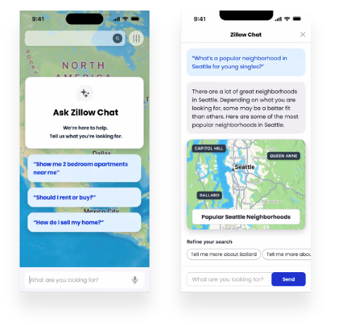
In my early days with Zillow, the team worked to evolve natural language search that enables users to enter multiple terms and phrases to specify what they’re looking for. However, the strings users entered had little to no context (within the same session or over multiple sessions).
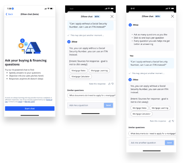
In 2023, we partnered with OpenAI to design conversational shopping experiences:
A finance assistant that helps buyers get early insight into what they can afford, their readiness for financing, and then prompts them to engage with a lending officer at the right time, and
A search assistant that helps buyers identify and curate homes and neighborhoods that meet their evolving criteria.
After months of internal testing with Legal and compliance teams, we made the deliberate call to stop both AI assistant efforts. Two distinct failure modes emerged that shaped everything that followed.
The first was regulatory. Housing recommendations generated by AI carry Fair Housing Act implications — the model's outputs could inadvertently steer buyers toward or away from neighborhoods in ways that create legal liability. Designing around that wasn't just a risk mitigation exercise; it was a human-in-the-loop problem. (moments where a person needs to step back in). Any AI-driven guidance in a regulated space requires explicit human checkpoints. We weren't positioned to build those guardrails correctly at the time.
The second was usability. Research — and Jakob Nielsen's 2023 findings on the articulation barrier — confirmed what we were seeing in testing: most buyers, especially first-time homebuyers, couldn't formulate effective search queries in a conversational interface. They knew what they wanted in a home but couldn't translate that into prompts. The conversational model compounded their uncertainty instead of reducing it.
Both findings pointed to the same solution: keep the intelligence, drop the open-ended conversation.
Keep AI — drop the conversation
Studies now show that many users can’t effectively write prompts, especially non-technical users (The Articulation Barrier: Prompt-Driven AI UX Hurts Usability, Jakob Nielsen May 25, 2023).
So we designed an experience that leverages our legacy NLS search and search results surfaces. With this new approach, buyers can speak or type phrases for AI to process, for example.
“4 bedroom, 3 bath, single family, mid-century modern home, with the primary bedroom on the main level, a large backyard, and within walking distance of a park and restaurants. I’d also like a pool, mature trees, and a 1-acre lot.”
Natural language search would have been unable to put much of that information into a proper context or remember the buyer’s input so they can refine it over time.
We also asked buyers to tell us which results were good and bad so that we could further optimize outcomes. Our research previously showed that buyers were reluctant to specify too many criteria because they feared it might narrow their results too much, but with AI search and the feedback mechanism, buyers reported higher quality search efforts.

A deeper sense of home
We collaborated with another design team to deliver an interactive experience on the home details page.
This feature leverages AI to address some of the simple questions buyers might otherwise click contact agent to answer. Now they could see the overall layout of a home, and change their views to see what rooms look like.
Key moments and learnings
While getting users to tour is a key goal for Zillow, helping users virtually see a home didn’t replace the need to tour — it did give users more confidence when choosing which homes to tour.
Principles I brought forward from this project
This project directly shaped how I think about AI product design — and the patterns I now apply across every AI experience I build.
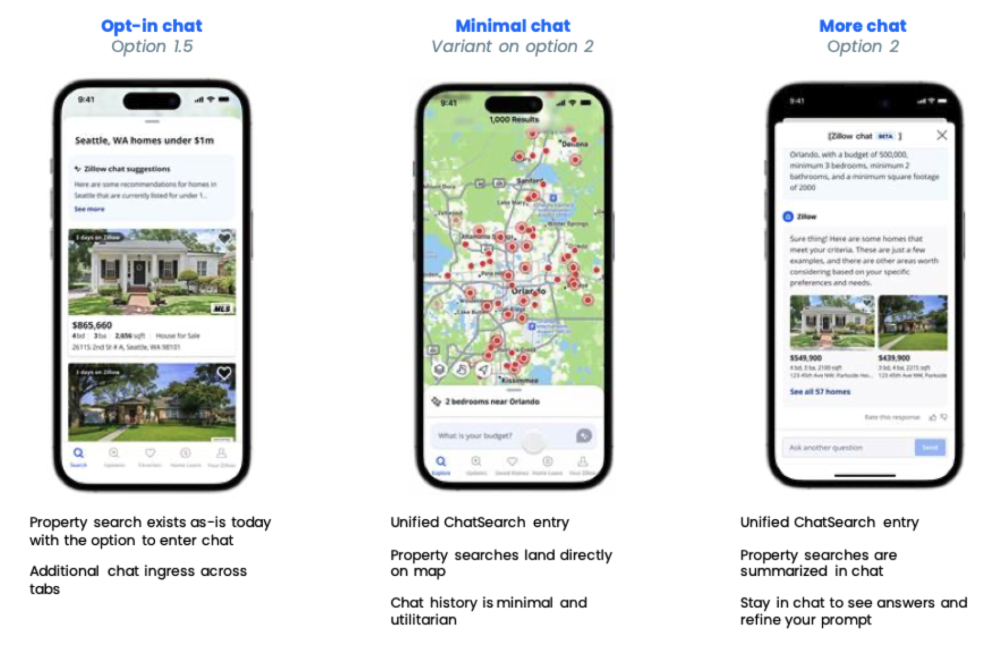
Conversational AI isn't always the right interface. The instinct to put a chat box in front of users is strong, but conversation requires users to know what to ask. When they don't — or when the stakes of a wrong answer are high — guided interactions, suggested prompts, and structured wedge experiences outperform open-ended dialogue every time.
AI in regulated industries demands governance-first design. Fair Housing taught me that AI transparency and human oversight aren't compliance checkboxes — they're design requirements. Every AI feature that touches a regulated domain needs explicit human-in-the-loop moments built into the experience, not bolted on afterward.
Next best action beats always-on CTAs. Placing conversion moments contextually — surfaced when a user has just learned something relevant — outperforms static, persistent calls to action. Our 10% reduction in post-CTA abandonment confirmed that users convert more confidently when they understand why they're being asked to act.
Design systems trained on AI produce better AI outputs. The vocabulary, personas, and tone guidelines we built for this project became the foundation for how we fed context to AI systems. That work — what I now think of as the "instructions for the machine" — is what made the NLS experience feel coherent and on-brand rather than generic.

AI also delivers personalization
Zillow’s home page performed extremely well in terms of SEO and driving traffic from the web. However, it provided no features for returning visitors to resume previous searches.
Research indicated that buyers who land on the home page, believed they had to start their search again. Many were unaware that Zillow had a feature that allows them to save search criteria from one session to the next. However, even with saved searches, there was no way to update legacy search criteria, which resulted in multiple search lists that generated unnecessary update emails from the Marketing team.
We introduced several features that leveraged AI to enhance our understanding of the buyer’s goals to suggest homes that are similar to their evolving search criteria. We also added a section entitled Pick up where you left off that eliminated any homes already viewed, so they could focus on new ones.
This feature also analyzed where buyers are likely to be in the home-buying process, so we could populate the home page with components that drive them to the next logical stage of their buying journey.
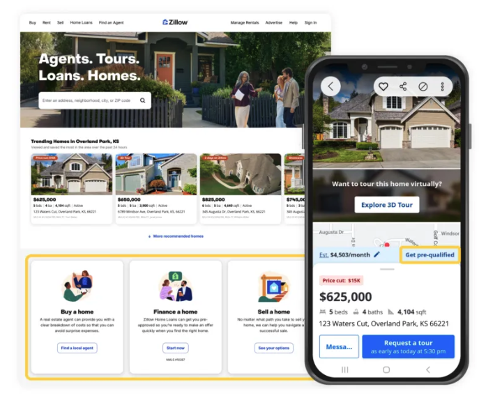
Triage helps you quickly decide if a home meets your needs
We conducted card sorting exercises to understand the information that buyers need to see before they will dig deeper to explore a home.
We then redesigned the home details page to move key information to the top of the page.
We A/B tested top designs to determine which one to deploy. We discovered that by moving key information to the top of the page, we moved a key CTA below the fold (which resulted in lowered conversion rates). So we changed the design so the CTA was always viewable at the bottom of mobile screens and on the side of web pages, so users could always see it, The conversion rates were immediately restored.


Next best action CTAs guide you confidently to your goal
We placed other CTAs on the spokes so that they’re available in those moments when the user has enough information or interest to benefit from them. For example, if a user views the spoke related to the home’s cost, the most relevant CTAs to place on the spoke are those related to financing.
We collaborated with other Product teams to define a framework for CTAs, so they know where on the home details page they can experiment with conversation moments without negatively impacting the shopping experience.
Key moments and learnings
Because we provided context, research showed users were better informed about why they might click the CTA at the end of a spoke
A/B tests showed a 10% reduction in post-CTA abandonment

Hub and spoke helps you find and focus on what’s important
To reduce page length, we explored a page layout that organized home details into a few key sections or “hubs”. Once a user determines they’re interested in more detail, they can find them on the spoke.
Key moments and learnings
User-tested 2 approaches
Discovered users who moved past triage section (interested shoppers) continued to page bottom more often than previously
Design performed well on mobile

Comparison tool helps you identify “the one”
We designed a feature that allows users to compare homes. This initial release was well received by customers and differentiated Zillow from competitors.
It was not the robust, customizable version that we initially envisioned, but it set the stage for true collaboration between co-shoppers and ultimately the agent.

Climate, school, and neighborhood data help you find the right lifestyle
Research insights indicated that when home buyers shop, they not only shop for a house, they shop for a lifestyle. Details that users expect include climate risk, noise, schools, and local amenities.
Our narrative helped highlight the importance of this information and how previously users went to other websites to get information about neighborhoods of interest.
Zillow leadership previously resisted adding this information because of legal and ethical concerns. However, our narrative helped paint a picture of how critical this information is to home shopping.
Key moments and learnings
We found that showing climate risk with map colors in an accessible way was challenging. Eventually, we were able to discover color schemes that work with visually impaired users.
All of these features involved working with third-party content providers; discovering one that aligned with company goals and cost parameters was the biggest challenge.
The competitive analysis provided the incentive we needed to convince leadership to provide the content.

Results


“The new design delivers a fun and efficient way to browse homes on the Zillow website, making it easier for home shoppers to navigate and process information," said Jenny Arden, chief design officer at Zillow.
(PR Newswire article, Oct 2023)
Key takeaways
Think broader than conversational interfaces
Leverage the design system to provide intelligent interfaces that adapt in real time to communicate with users
Provide JTBD, processes, personas, and other user goals as inputs to the AI
Uncover the real outcome for each job (not just the task)
Craft suggested prompts for tasks and insights most needed for each persona